Amazon wasn’t built for browsing. Oh sure, they have a fully-functional search engine, one of the most heavily used, but most people go there only when they know or have a darn good idea what they want.
According to a study done late last year, Amazon was the top place people searched when they knew what they wanted, but other search engines such as Google were tops when people didn’t know what they wanted, when they were browsing.
Amazon wasn’t built for browsing. But the bigger question is … are you? This is one area where you can kick Amazon’s virtual ass. Are you maximizing this advantage?

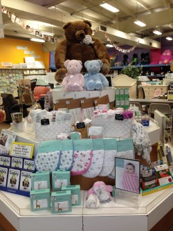
Browsing is a visual game of Capture-the-Eye.
When a customer walks through your door, what catches her eye? Where does she look? Do you control that or does she? Do you give her a place to look or not?
Think about your grocery store. When you walk in, what is the first thing you see? Produce! What is the most visually compelling item in a grocery store? Produce! Coincidence? I think not.
When a customer walks through your door her eye will be drawn to a focal point. Where that eye goes is dependent on three things:
- The geometry of the store
- The angle at which she enters
- What you give her to see
THE PATH
Walk into your store and see where, based on the geometry and angle, your eye is naturally drawn. Do you have something compelling to see there? That is your Spotlight Spot. Put something cool, profitable, new, and visually compelling there.
Walk over to that spot and look around again. Where does the eye travel? Better yet, where do you want it (and her) to travel? Make sure all those options are easily visible from this location.
 This is how you create a shopping path through your store, one visual display at a time. If you have a whimsical, boutique store layout, you can lead customers through your store one display at a time and make sure they see exactly what you want them to see.
If you have long aisles like a grocery store, the aisles themselves dictate some of your traffic. Your endcaps of each aisle become your most obvious locations for compelling visual displays.
But while great endcaps can draw customers and sell a lot of merchandise, they don’t get customers to go down your aisles. You draw a customer to each aisle by how you merchandise the first four feet of that aisle. The first four feet are what she can see from the main aisle. If it doesn’t catch her eye, she walks on by.
Once you get her to the aisle, you need something in the middle of the aisle that draws her gaze. If the shelves are all the same level all the way through, she’ll take a look, feel like she’s seen the whole aisle and walk on. You have to break the lines in the middle to get her attention.
(Note: you should try to keep the shelves the same level all the way to the visual break in the middle. If the shelves are constantly changing height every four feet then the aisle is a hot mess that won’t get people browsing, either. If they are the same level, they draw the eye down to the visual break in the middle.)
Merchandising is a game designed to encourage browsing and discovery. It is a game designed to control traffic flow and guide customers through your store. It is a way to put the products in front of your customers you want them to find.
To paraphrase Mark Twain …
Those who don’t merchandise their stores consciously have no advantage over those who can’t merchandise.
CHANGE IT UP
 One question often asked about merchandising is how often to change up the displays. That answer depends on several issues. You should change your displays for any of these reasons:
- The seasons change
- The buying cycle changes
- You have something newer to show off
- You don’t have enough product to fully fill the display
- Your product mix in your store is constantly changing
People will still come in asking for certain products or Brands. If you have a major draw, put that Brand in the back of the store to draw people in deeper. Then build visual displays to lead the customer back to the front of the store.
Build your store for browsing. Guide your customers through your merchandising to the products you want them to buy. Play the Capture-the-Eye game and you’ll capture her dollars, too.
-Phil Wrzesinski
www.PhilsForum.com
PS When you enter your store to see where your eye is drawn, also ask yourself this question … “How far into the store can I see?” The deeper the better. If you don’t have anything visual to draw the eye to your back wall, find something. The deeper people can see, the farther they are drawn in. That’s the other reason produce is always near the front of a grocery store. Not only is it visually compelling, you can look over it to see more deeply into the store.
PPS Not surprisingly, a website design is similar to the merchandising game. Each page needs to be visually compelling and lead you directly to the next action/page/display. If you have too much on the page, drawing the eyes all over, your web page is a hot mess.
